27 Letterhead Examples for Business, Personal and More
Explore original professional letterhead designs, grouped by type and explained. Download a free Word template or create your own with your logo and colors.
- 27 original designs
- Free Word downloads
- No sign-up
Browse by industry
 Business6 designs
 Law firm3 designs
 Medical3 designs
 Church3 designs
 School3 designs
 Personal4 designs
 Nonprofit2 designs
 Christmas3 designs
All 27 letterhead examples, by type
Every design is original. Thumbnails zoom in on the header; click one to see the whole US Letter page.
Business
More on business letterheadModern Business
Northfield Consulting Group · Split header
Two-column header keeps the brand on the left and every contact detail on the right, so the reader finds both at a glance.
Construction Company
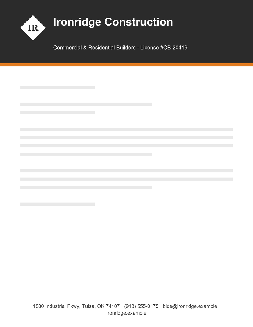
Ironridge Construction · Color band
A solid band reads as sturdy and confident. The license number in the tagline answers a question clients ask first.
Real Estate
Crestview Realty · Logo left
A round mark beside a serif name feels established and approachable, which suits a business built on trust.
Minimalist Tech Company
Brightline Software · Minimal
Minimal header, one accent rule and a lowercase-friendly logo. It feels modern without competing with the letter.
Accounting Firm
Hale & Moss CPAs · Centered
Centered serif type with no logo is the most traditional business letterhead. It works when the name itself is the brand.
Logistics Company
Summit Logistics Inc. · Footer band
Moving the contact details into a footer band leaves the top clean and gives every page a consistent base.
Law firms
More on law firm letterheadProfessional Law Firm
Harlow & Whitaker LLP · Centered
Restraint is the point: centered small caps, generous spacing and nothing decorative. Law firm letterhead should feel steady.
Attorney with Sidebar
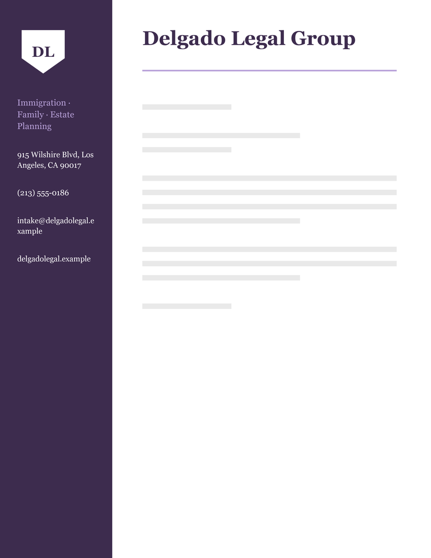
Delgado Legal Group · Sidebar
The sidebar is the classic home for attorney names and practice areas, and it leaves the full width for the letter.
Modern Law Office
Park Ellis Attorneys · Split header
A thin red rule adds one note of color to an otherwise black-and-white header, which is enough to be memorable.
Medical and dental
More on medical letterheadDental Office
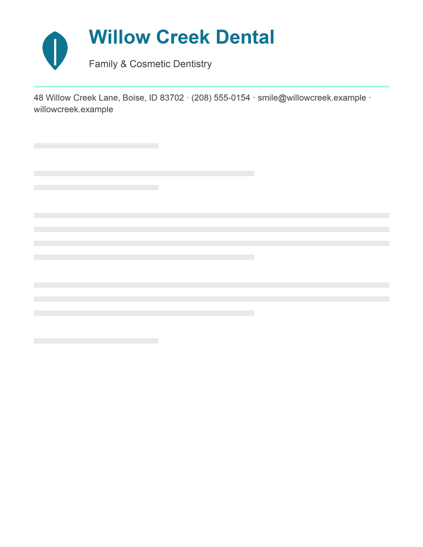
Willow Creek Dental · Logo left
Soft teal and a leaf mark feel calm and clean. Medical letterhead should reassure before it informs.
Pediatric Clinic
Riverside Pediatrics · Color band
A friendlier blue band with a warm accent works for a pediatric practice without looking childish.
Physical Therapy Practice
Okafor Physical Therapy · Minimal
Clean lines and a green accent suggest health and movement, and they keep referral letters easy to read.
Churches
More on church letterheadTraditional Church
Grace Community Church · Centered
Service times in the tagline turn every letter into a quiet invitation, which most church letterheads miss.
Parish
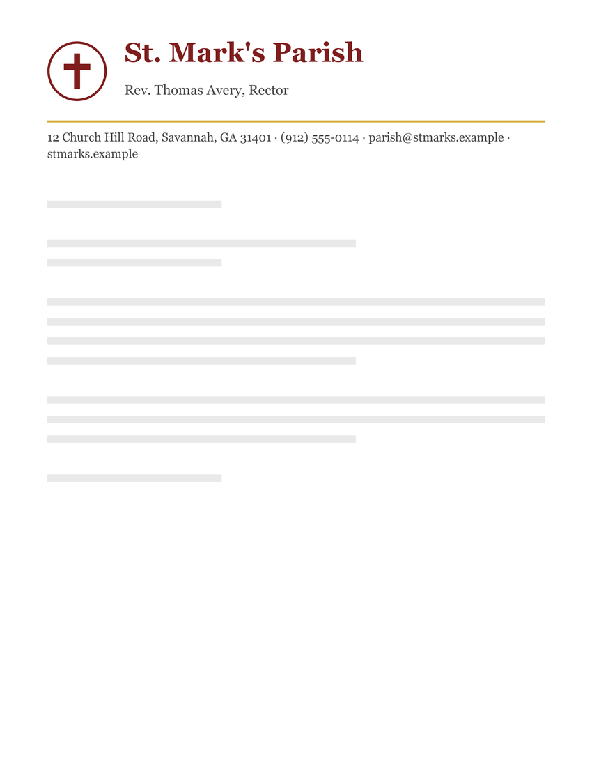
St. Mark's Parish · Logo left
Naming the rector under the parish name tells the reader who the letter speaks for. Deep red and gold feel traditional.
Modern Church
New Hope Fellowship · Footer band
A modern sans-serif and a footer band suit a contemporary congregation. The top stays light and welcoming.
Schools
More on school letterheadElementary School
Lincoln Elementary School · Logo left
A crest, the district name and the principal on one line give parents everything they need to trust and reply.
Private School
Westbrook Academy · Centered
A founding year and grade range are a private school's credentials. Centered under a crest, they read as heritage.
High School
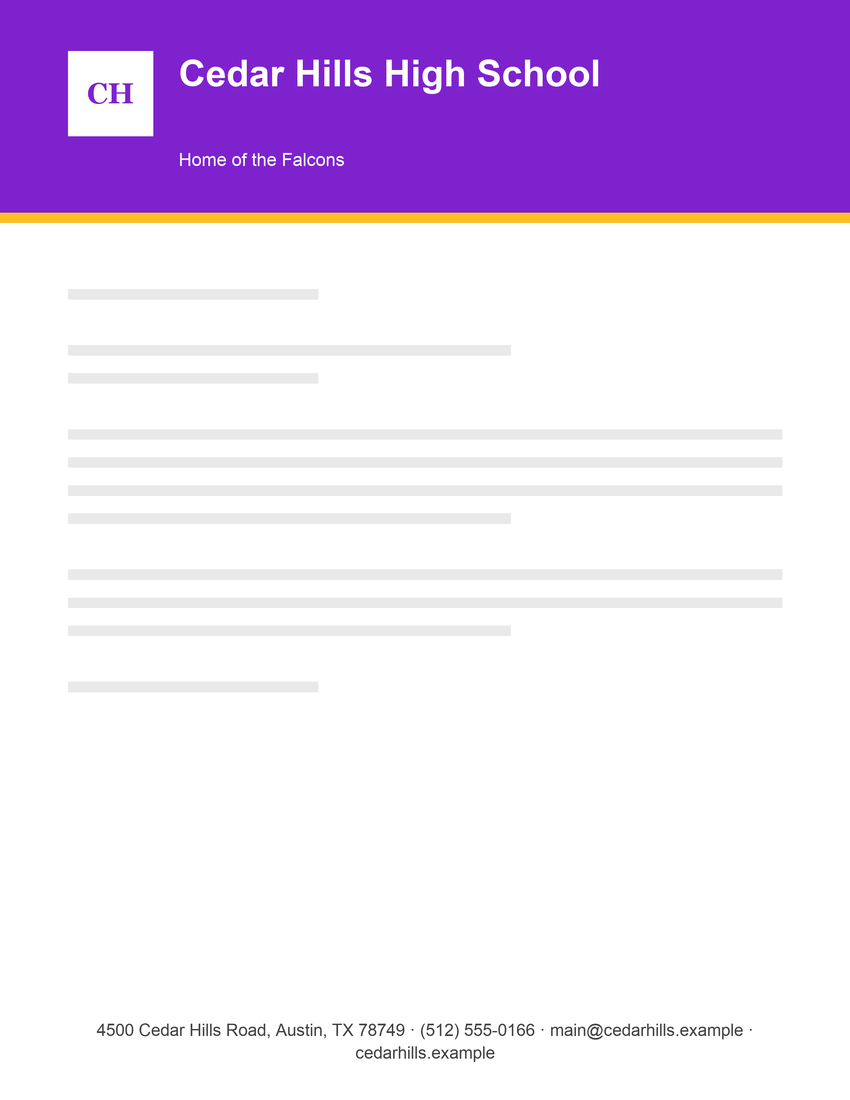
Cedar Hills High School · Color band
School colors in a full band and the mascot line add pride. Good for athletics and activities correspondence.
Personal
More on personal letterheadPersonal Monogram
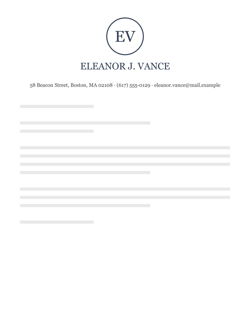
Eleanor J. Vance · Monogram
A centered monogram is the classic personal letterhead, ideal for thank-you notes and formal correspondence.
Cover Letter and Resume
Marcus Reid · Split header
Matches a resume header so a cover letter and CV look like a set. City only instead of a full address is fine today.
Freelancer
Priya Raman · Minimal
A single accent rule in a personal color is enough for a freelancer's invoices and pitches.
Family Monogram
The Calloway Family · Monogram
A single-initial family monogram works for holiday letters, invitations and household correspondence.
Nonprofits
More on nonprofit letterheadFood Bank Nonprofit
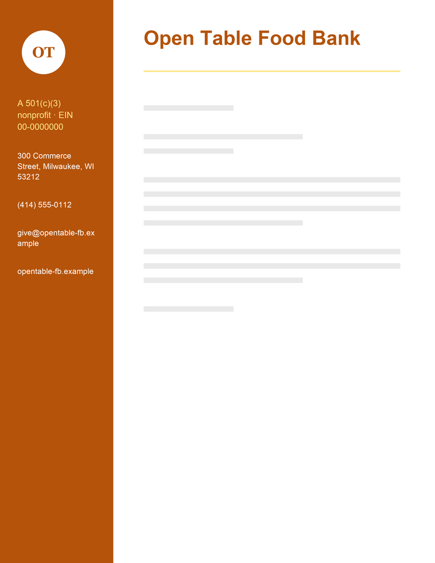
Open Table Food Bank · Sidebar
Nonprofits often show 501(c)(3) status and EIN, which donors need for tax records. The sidebar can also list board members.
Conservation Nonprofit
Coastal Wildlife Trust · Footer band
A founding year in the tagline signals staying power, and staying power is what grant makers look for.
Christmas and Santa
More on Christmas letterheadLetter from Santa
Santa's Workshop · Centered
A traditional red seal and centered header leave plenty of room for a handwritten Christmas letter.
North Pole Post Office
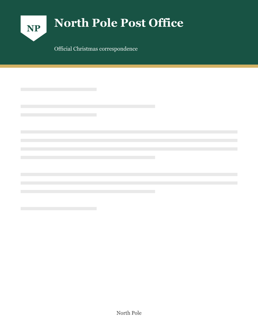
North Pole Post Office · Color band
An evergreen band and gold accent make a festive header for a letter from Santa.
Family Christmas Letter
Christmas Wishes · Minimal
A light, ink-friendly design for a family holiday update or a Christmas thank-you note.
The Word files have a simplified, editable header without the sample logo. To add your own logo or print the full layout, choose Add your logo.
Add your own logo
Open any design in the free maker, add your logo and details, and download a Word file or PDF.
How to choose a letterhead design
Most designs fall into four styles. Pick the one that matches how formal your letters are, how you print them and how strong your brand color is.
| Style | How it reads | Best for | Printer ink | Examples above |
|---|---|---|---|---|
| Minimal Minimal, split header | Modern and quiet. The letter does the talking. | Tech companies, consultants, freelancers, therapists | Lowest: thin rules only | Tech company, modern business, physical therapy, freelancer |
| Traditional Centered, monogram | Formal and established. Often no logo at all. | Law firms, accountants, churches, personal letters | Low: type only | Law firm, accounting firm, church, personal monogram |
| Logo-led Logo left | Approachable. The mark is the first thing the reader sees. | Real estate, dental offices, schools, parishes | Low to medium | Real estate, dental office, elementary school, parish |
| Bold color Color band, sidebar, footer band | Confident and brand-forward. | Construction, high schools, nonprofits, logistics | Highest: large solid areas | Construction, high school, attorney sidebar, food bank |
Designs that save printer ink
If you print letters at home or the office, choose a minimal or traditional design. They use thin rules and type instead of solid color, so they print quickly and look the same on any printer. Color bands, sidebars and footer bands cover a large area with ink. Home printers also can't print to the edge of the page, so those designs print with a white margin unless a print shop trims them. For letters you mostly send as PDFs, ink doesn't matter and a bold design is fine.
Where the logo and contact details go
Every design has the same parts. Here they are on the modern business sample:
(303) 555-0142
hello@northfield.example
northfield.example
- Logo: the visual mark, usually top left or centered.
- Name: the legal or trading name of the company or person.
- Tagline or descriptor: what you do, a license number or a slogan (optional).
- Contact details: address, phone, email and website.
- Divider: a rule or color band that separates the letterhead from the letter.
- Body area: left clear for the date, recipient and message.
- Logo top left, contact details top right. The split header is the fastest layout to scan. See the modern business and cover letter examples.
- Logo or crest centered above the name. Formal and symmetrical, common for law firms, private schools and holiday stationery. See the private school and Santa examples.
- Logo beside the name, contacts in a row below. Keeps the header short. See the dental office example.
- Contact details in the footer. Leaves the top of the page clean and repeats on every page. See the logistics company and conservation nonprofit examples.
- Contact details in a sidebar. Room for attorney names, board members or practice areas. See the attorney and food bank examples.
What makes a good letterhead?
The strongest designs here have a few things in common. Use these as a checklist when you design your own.
Common questions
Are these letterhead examples free to use?
Yes. Every design and Word template is free for personal and commercial use. You can edit, print and use them for your business; please don't resell the template files themselves.
Are the companies in the examples real?
No. Every name, address, phone number and email address is fictional and only shows where your own details go.
What should a letterhead include?
Your name or organization name, logo, mailing address, phone number, email address and website, plus any details your location or profession requires, such as a company registration number in the UK or a contractor license number in some US states. See what is a letterhead for the full list.
What paper size should I use?
US Letter (8.5 × 11 in) in the United States and Canada, and A4 (210 × 297 mm) almost everywhere else. The Word templates are US Letter; the letterhead maker can also make A4. See letterhead format for margins and header height.
How do I add my logo?
The quickest way is the letterhead maker: choose a design, upload your logo and download a Word file with the logo already in the header. In a downloaded template, open the header in Word and use Insert › Pictures.
Guides and tips
Step-by-step help for Word, Google Docs, formatting and printing. View all guides
- Word, Google Docs and PagesHow to Make a Letterhead in WordSet margins, open the header, add your logo and handle the second page.
- Word, Google Docs and PagesHow to Create a Letterhead in Google DocsBuild a letterhead from scratch in Google Docs, or import a free Word template.
- PrintingHow to Print Letterhead Without Cutting Off the DesignFix clipped logos, bands and footers: printer margins, scaling, paper size and bleed.
- Format and designLetterhead FormatPaper sizes, margins, header height and where each element goes.
- Format and designBest Fonts for LetterheadSafe fonts for Word and Google Docs, good pairings, sizes and fonts to avoid.