Home › Guides › Best letterhead fonts
Best Fonts for Letterhead
A letterhead font has to do three things: match your brand, stay readable at small sizes, and look the same on every computer that opens the file. Here's how to choose one.
Quick answer: for a letterhead other people will edit, use a font that's installed almost everywhere. Georgia, Garamond or Cambria for a traditional look; Arial, Calibri or Verdana for a modern one. Use one or two typefaces at most, set the name at 16–24 pt and the contact details at 8–10 pt. If you use a custom brand font, send letters as PDFs so the font can't be swapped.
What makes a good letterhead font
- Readable at 8–10 pt. Contact details are the smallest text on the page. Very thin, condensed or decorative fonts become hard to read at that size, and thin strokes can break up on a home printer.
- Consistent with your brand. Use the same typeface as your logo, website and business cards, or one close to it.
- Installed where the file is edited. If a colleague opens your Word template on a computer without your font, Word substitutes a different one, and the layout can shift.
- Suits the tone of your letters. A law firm writing to the court and a bakery writing to customers need different voices.
Serif or sans-serif?
Serif fonts have small strokes at the ends of letters. They read as traditional, formal and established, which is why law firms, accountants, churches and personal stationery use them. See the professional law firm, accounting firm and personal monogram examples.
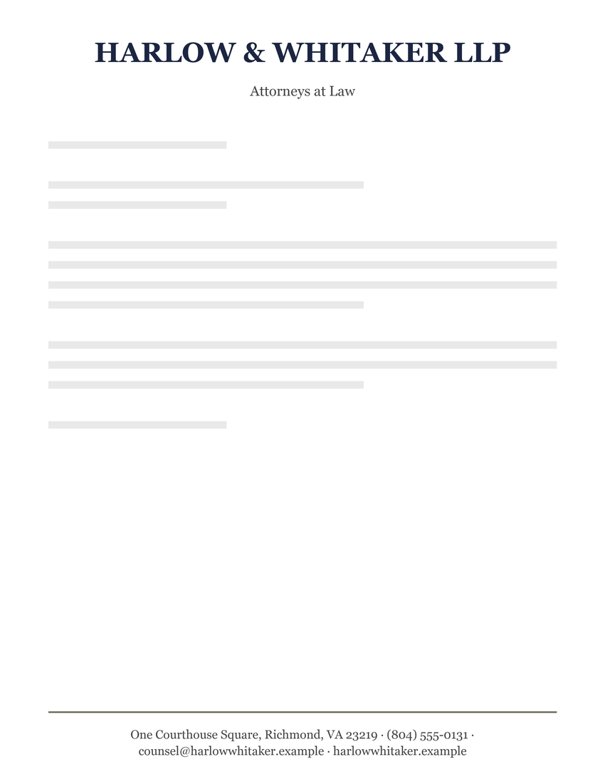
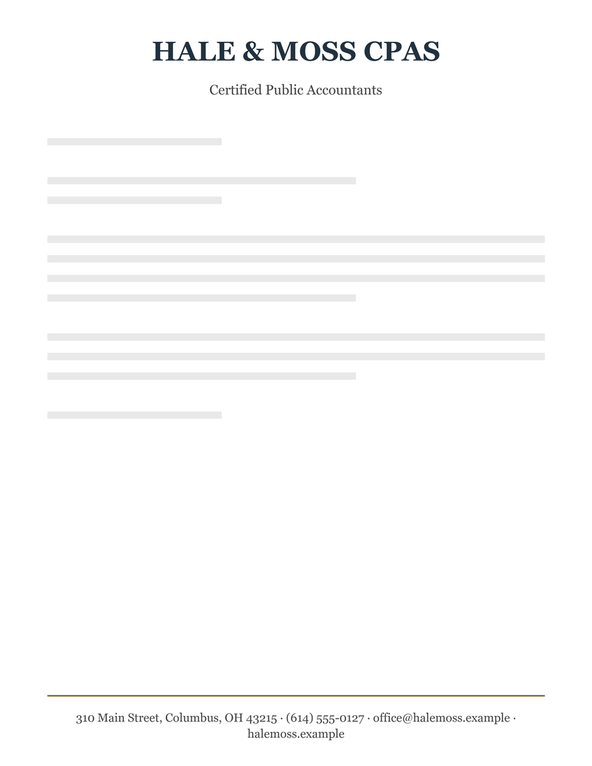
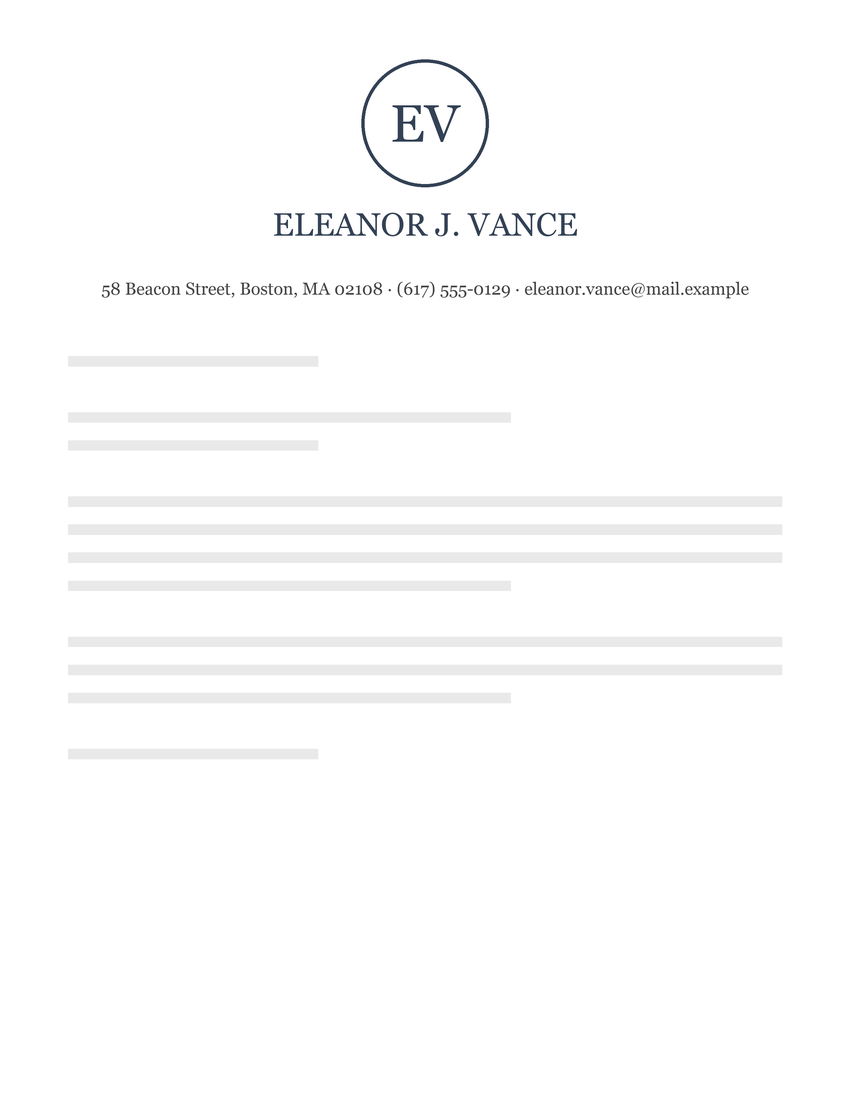
Sans-serif fonts are plain, without those strokes. They read as modern, clean and direct, which suits tech companies, consultants, medical practices and schools. See the modern business, tech company and dental office examples.
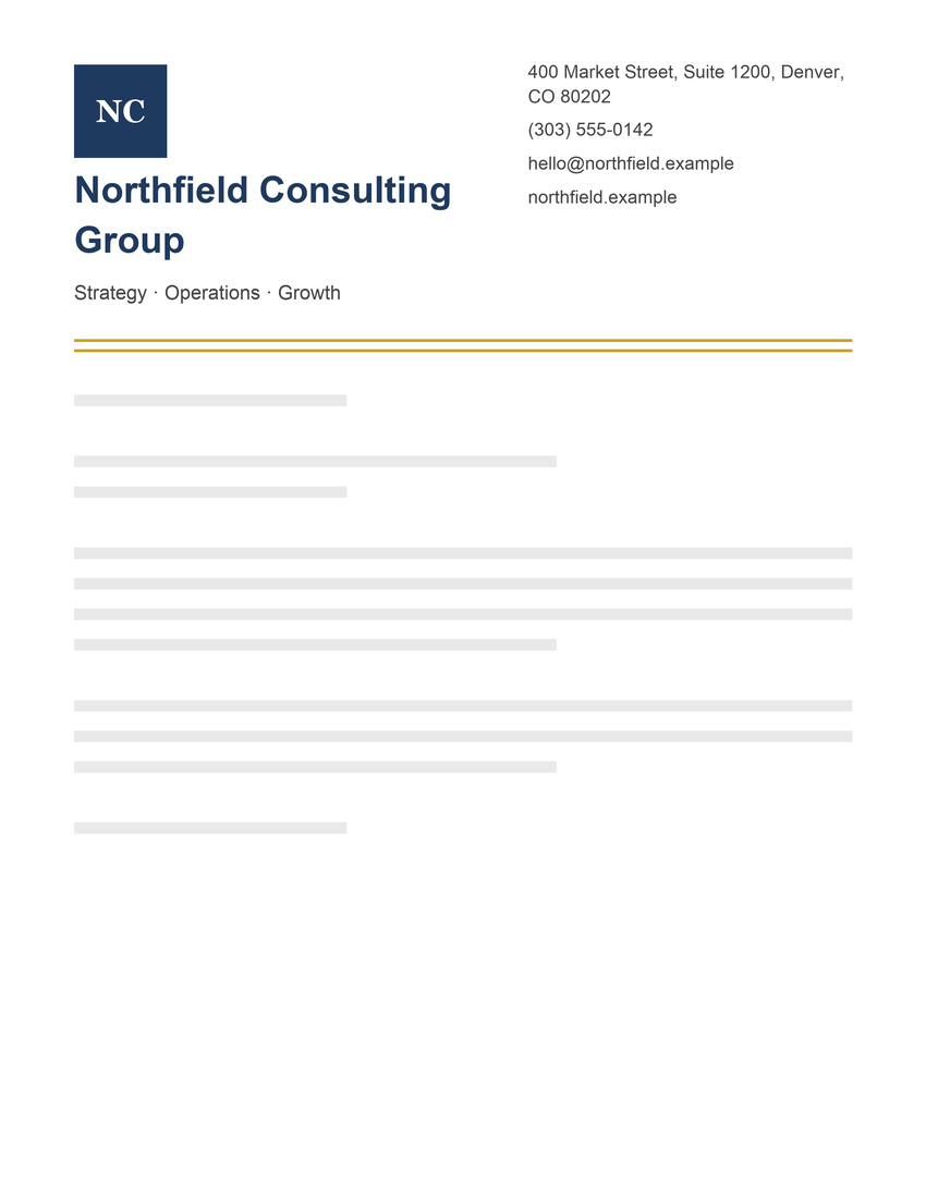
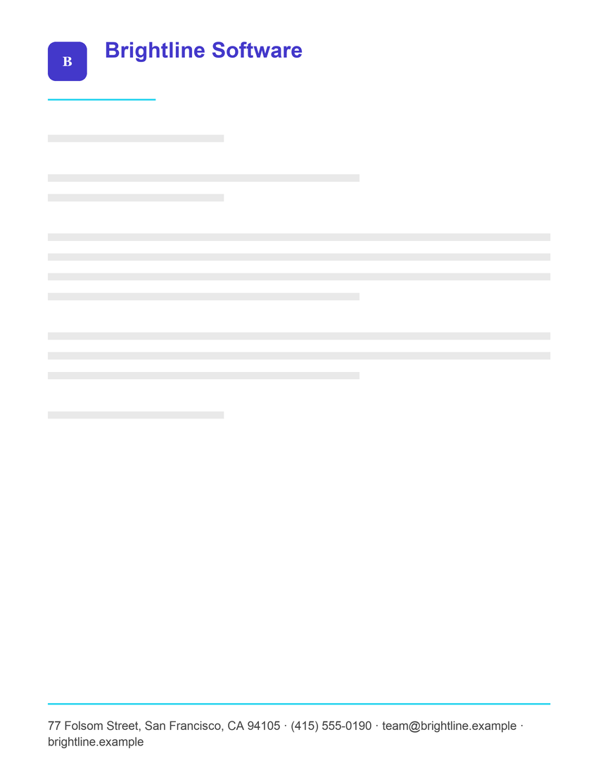
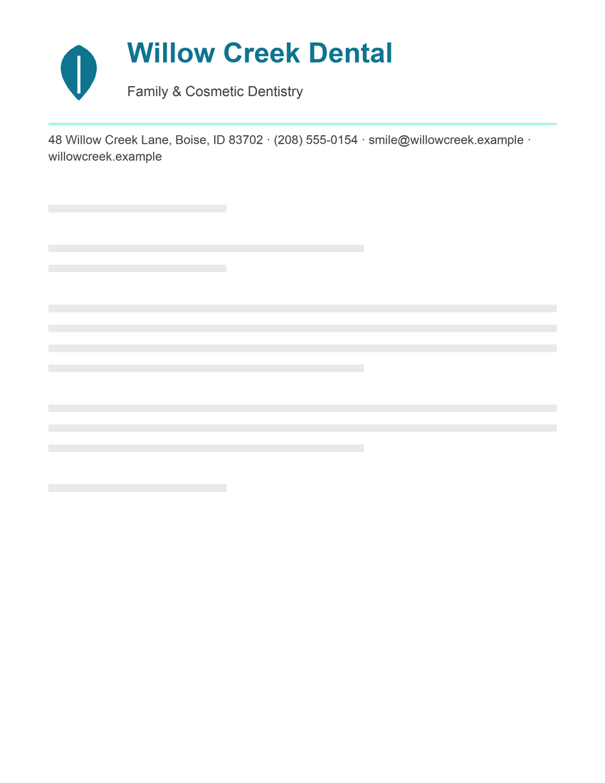
Neither is more professional. Choose the one that matches how your organization wants to sound.
Safe fonts for Word letterhead
These fonts come with Microsoft Office on Windows and Mac, so a Word template that uses them looks the same on almost any computer.
| Font | Style | Good for |
|---|---|---|
| Georgia | Serif, sturdy and very readable on screen | Law firms, nonprofits, churches, personal letters |
| Garamond | Serif, classic and elegant | Formal and personal correspondence |
| Cambria | Serif, designed for screen and print | Professional services, schools |
| Times New Roman | Serif, compact and traditional | Legal and academic letters |
| Arial | Sans-serif, neutral | Any business; the safest choice |
| Calibri | Sans-serif, soft and modern | Offices, clinics, small businesses |
| Verdana | Sans-serif, wide and very legible at small sizes | Contact details and small print |
Newer versions of Microsoft 365 use Aptos as the default font. It's a good modern sans-serif, but older versions of Word don't have it, so avoid it in a template you'll share widely.
Our free Word letterhead templates use Georgia for serif designs and Arial for sans-serif designs for exactly this reason.
Fonts for Google Docs letterhead
Google Docs includes the common fonts above, such as Arial, Georgia and Times New Roman, plus hundreds of free Google Fonts under Font › More fonts. Because Google Docs fonts load from the web, anyone who opens your document in Google Docs sees the same font. Good choices for a letterhead include:
- Serif: Merriweather, EB Garamond, Playfair Display (for the name only, it's too detailed for small text)
- Sans-serif: Lato, Roboto, Open Sans, Montserrat
If you download the document as a Word file and open it on a computer without those fonts, Word substitutes them. Download a PDF instead when you need an exact copy. Our Google Docs letterhead guide covers importing and editing templates.
Font pairings that work
One typeface for the whole letterhead is often the cleanest choice. If you want contrast, pair a distinctive font for the name with a plain one for everything else.
| Name | Tagline and contact details | Feel |
|---|---|---|
| Georgia | Arial | Traditional name, crisp details |
| Garamond | Calibri | Elegant and approachable |
| Cambria | Calibri | Professional and consistent |
| Playfair Display | Lato | Stylish, for Google Docs |
| Montserrat | Montserrat | Modern, one family throughout, for Google Docs |
Font sizes for letterhead
| Element | Size |
|---|---|
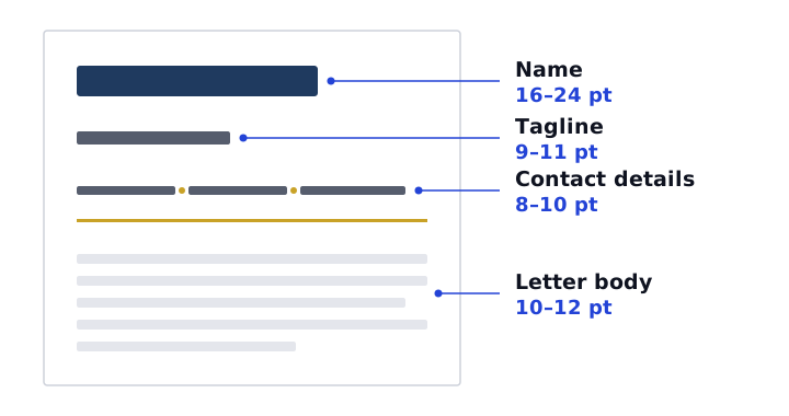
| Name or organization | 16–24 pt, the largest text on the page |
| Tagline or descriptor | 9–11 pt |
| Contact details | 8–10 pt |
| Letter body | 10–12 pt |
For margins, header height and layout, see letterhead format.
Fonts to avoid
- Novelty fonts such as Comic Sans and Papyrus. They distract from the letter and rarely match a brand.
- Script fonts for contact details. A script name can work for personal stationery, but addresses and phone numbers in script are hard to read.
- Very thin or light weights at small sizes. They look fine on screen and fade on paper.
- Three or more typefaces. The letterhead starts to look busy and inconsistent.
- Fonts you don't have a license for. Commercial fonts often need a license for business use. Google Fonts are free to use, including commercially.
Using a custom brand font
If your brand uses a font most computers don't have, you have three options:
- Send PDFs. A PDF keeps the exact font, so it looks right for every reader. This is the simplest option.
- Embed the font in the Word file. In Word for Windows, open File › Options › Save and tick Embed fonts in the file. The file gets larger, and some fonts' licenses don't allow embedding.
- Use the brand font only in the logo. Put the name in your logo image and use a standard font for the contact details. That way the editable parts never depend on a missing font.
The letterhead maker lets you choose a classic serif or modern sans-serif and add your logo as an image, so your brand font can live in the logo.